Some Hows? and Whys?
PowerPoint is a very powerful tool if used well and there are many features available for the creative speaker. However, because it has many possible ‘tricks’ and animations some speakers feel these must be used at all costs. So words ‘swoosh’ onto the screen, then spin and zoom without purpose. Rather than enhance the presentation, such activity can lead to the point that the speaker is making becoming lost in visual activity. Don’t do it! Admittedly, some animations can liven up a presentation, but do be careful that each one is used purposefully and not just because it is possible!
So, in constructing a PowerPoint presentation where do we start?
1. Venue
When preparing a presentation it is important to know the venue and the size of screen that will be used. If there is intimacy, with everyone close to the screen, it is possible to include more detail on each slide than if the venue is large with some of the audience at a significant distance. Since this information is not always known in advance a wise speaker should assume that slides must be readable from some distance since this is also acceptable for close ups.
2. Text
Size and Space
- Fonts are best kept ‘clean’ – avoid ones with serif, italicised etc
- When laying out a slide it can be tempting to build in a lot of space between lines of text. It feels as if this may make it easier to read. Not true! It is better to enlarge the text and reduce the space between lines.
Let me show you with an example from a workshop I run on Good Practice in Ministry with the Poor.
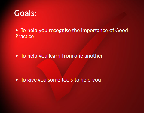
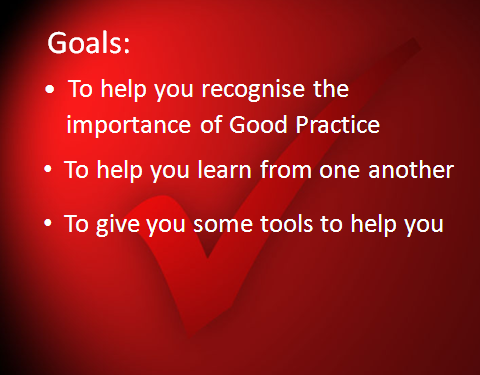
Here are some guidelines:
- Try to use not more than 12 lines of text – aim at 8 if possible – and at least 30pt typeface
- Use more than one slide if necessary in order to keep the 12 line rule
- Always change slides with change of subject
- Key words are sufficient to support the speaker’s presentation – exceptions may be where a portion of scripture is needed in which case the text may look quite ‘dense’, perhaps spread across several slides.
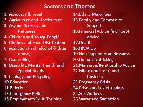
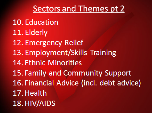
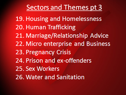
Here is another example from the same workshop, listing some of the key sectors in which ministries may be held. Here, I have divided a cluttered slide into three: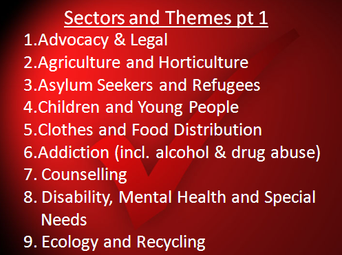
3. Bullet points and numbers
Use of bullet points has several benefits:
- Highlights key words
- Breaks up the text
- Less words so allows a large type face to be used
- Helps distinguish between topics and sub-topics.
- Makes each slide ‘high value’ as it minimises words
4. Reveals
In order to avoid distracting the hearer, it is best to reveal each bullet point as you come to it. It then becomes clear which point is being discussed. Also, be faithful to the listener. It can be frustrating if a speaker says he is going to make 3 points but then not to projecte them onto the screen at the right moment as he moves from one to the next!
How to make these ‘reveals’ attractive is a matter of choice. They can be dynamic, flying from one side of the slide or growing, spinning around or going through some other antic. Personally, I find that ‘simpler’ is usually ‘better’ and less distracting – I normally use ‘appear’. But those who are creative may be able to produce something more interesting while avoiding the temptation of ‘all singing and dancing’ presentations.
5. Diagrams
Diagrams and pictures often communicate better than words. But they must be clear. If a lot of detail is required gradually build up the diagram explaining each step before adding further information.
In the next blog we shall consider some simple matters of design and navigation.
